Mar 29, 2013 | interviews, painting
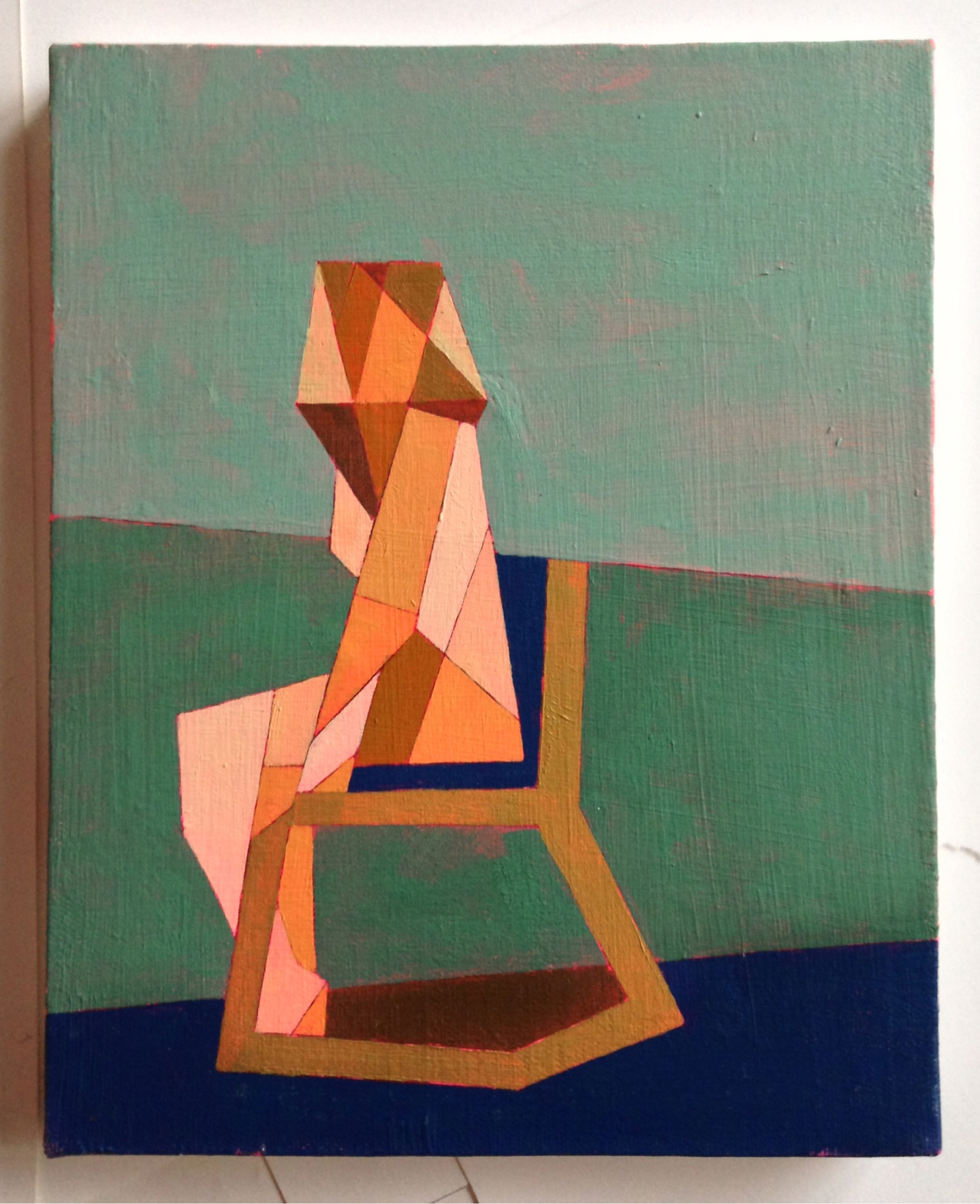
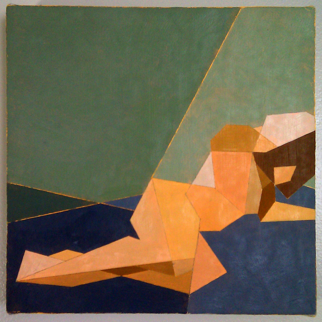
The women in Ian Gage’s paintings have recently begun transitioning – changing from realistic women splashed in dark paint to geometric pixillations that fragment her body and surroundings. The result is a shattered representation of women like minimalist stained glass windows, the light shining off of each shape differently, and with her body arranged in sometimes symmetrical but always balanced compositions.
Toll, Knell, & Peal reveal three different interpretations of the same front facing woman, and in each, her body is shattered into different shapes shaded in different shades of light. The transition between Ian’s realism style and his fragmented one can be traced from work to work, like a breadcrumb trail of the artistic process. Scrolling through his Tumblr is like reading a mystery novel where all the clues are visual, connecting the works that come before and after.
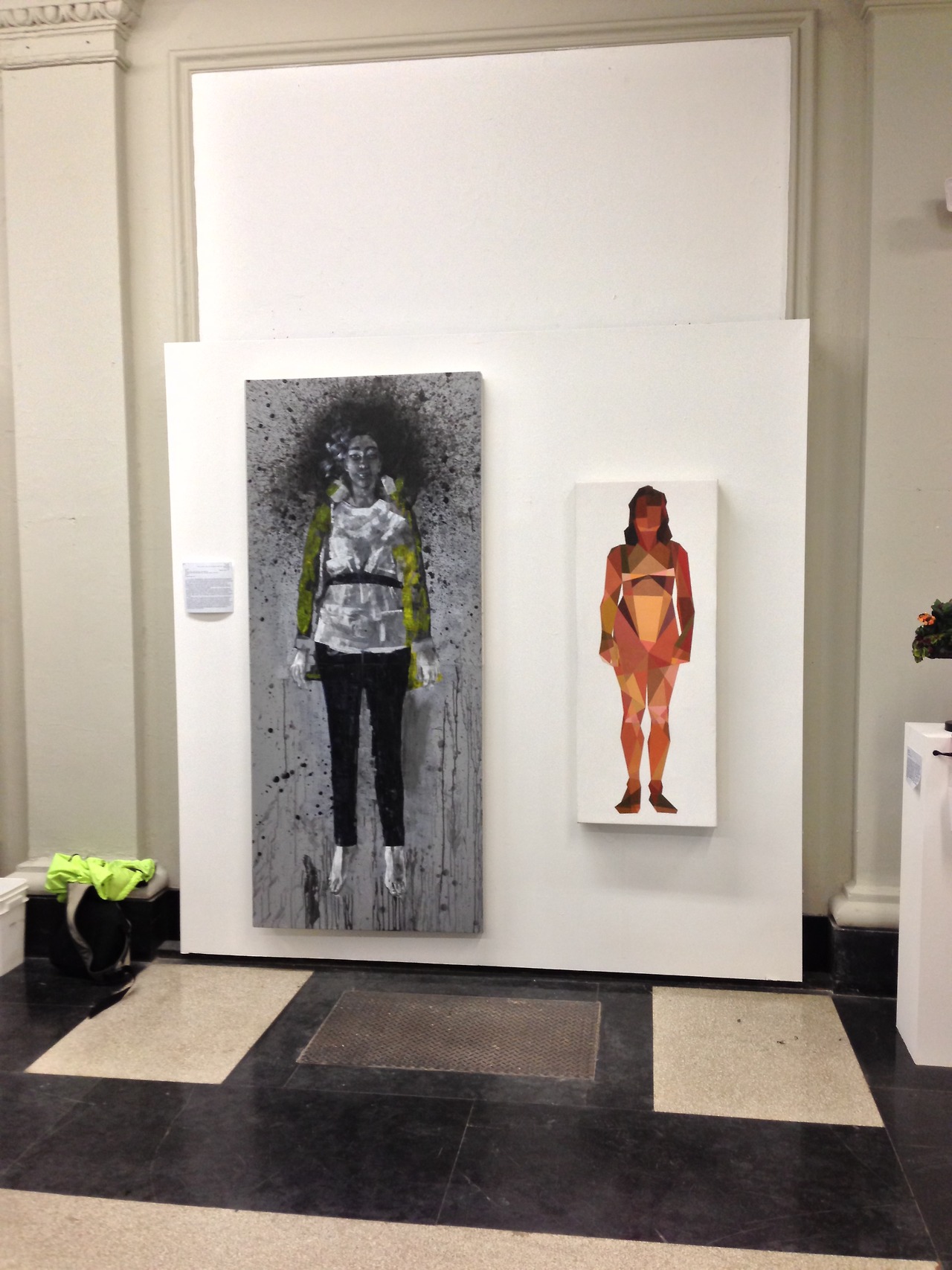
Cease and Knell shown at the Sustain/Able show at MassArt, 2012
What is the first thing you can ever remember drawing?
I think Godzilla. I was pretty preoccupied with typical giant robot/creature type products as a child—typically referred to as kaiju, though I don’t usually throw around that term. A Google search of that pretty much sums up the things I drew as a child.
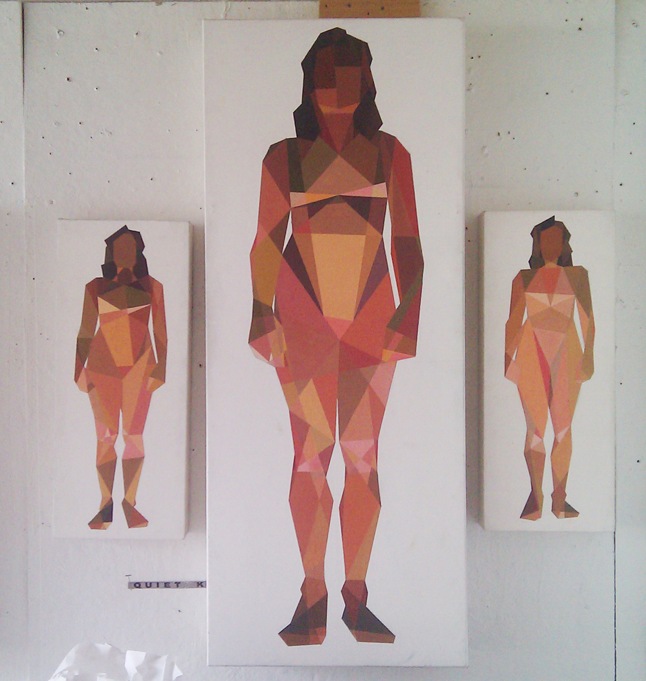
Toll, Knell, & Peal
To you, what is it about women that make them so worth painting?
The anecdote I usually dispense as an answer for this is that I only took up an interest in drawing in response to a middle school crush. The crush in question was very interested in art and I pursued it to impress her. She moved away and nothing ever came of that, but I kept drawing. Ever since that point I’ve been interested in drawing or painting my romantic interests—it’s fairly transparent at this point to the people close to me.
I think there are a lot of things about painting women, in particular romantic interests, which one has to be cautious about. The first thing you hear in art school is that portraying someone you’re close to inevitably leads to an idealization complex—you’re never really able to accurately portray your subject because you’re occupied trying to flatter them. I’d like to think I’ve broken that barrier based alone on my obsession with proportionate accuracy, but one can never be trusted to judge themselves objectively. I can at least say in my defense that no one has mentioned idealization critically to me for probably two years. The second—and more broadly relevant point of caution, is my position as a male painting the female form. After seeing a Hilary Harkness lecture this past fall I grew somewhat uncomfortable with the plausibility of being labeled a misogynist based on my work, and so I try to be as aware of the presence of the male gaze in my paintings as possible. The effectiveness of that awareness can really only be judged by the female audience—I am at their mercy under the circumstances and that is the way it ought to be. Those are the two chief dangers I think.
I realize of course I have yet to answer the question, but that feels like some necessary pretext. I think I’ve always been very interested in making art about women due to their general impact on my life; it’s difficult to give an answer less nebulous than that. Painting women is something I generally don’t question, it’s just something that feels necessary, and has felt more so as I’ve gotten older. Continuing painting women, and justifying it, involves a lot of thought and deliberation on a daily basis; particularly revolving all of the implications of me painting women, and of painting women in general.
Untitled, Oil on canvas, 12”x16”
When did you first begin moving away from straight representations to geometry-inspired interpretations, and why?
I really started painting the geometric pieces in Catherine Kehoe’s representative painting class. From the beginning of the class I assumed we were learning to paint representatively (a logical assumption) but we were in fact learning the building blocks. I assumed the class structure would revolve around Kehoe giving us broad lessons on the tenets of painting naturalistically, and then individual suggestions to improve the realism of our work. I was chiefly interested in exhaustive detail—I wanted to paint like Scott Prior by the end of the class.
I found fairly quickly she was teaching the opposite of detail. Kehoe encouraged us to reduce the picture plane to the simplest shapes possible. I fiercely resisted this for about half of the semester, at which point I became exasperated and painted an exhaustively reductive study in an attempt to parody her lessons. It was absolutely meant to be a juvenile jab at her teaching, but to my surprise she loved the painting and encouraged me to pursue it further. For the duration of the class I developed a vocabulary in a style I had originally created as a joke, and grew to like it despite the fact I was painting expressive acrylic paintings in my personal studio. When I had my final critique in my painting studio the professor and guest artists were enamored of the Kehoe paintings and uninterested in my expressive paintings. That was the point at which I decided I needed to explore reductive painting more.
Untitled, Acrylic on canvas, 12”x16”
How would you describe the differences between those two styles?
Per the usual tortured artist criteria: I was in an emotionally turbulent point in my life for about a year, during which I lacked a single subject to paint. During that year I was really painting self-portraits with other people’s faces—I wanted to paint women but really just wanted to paint what I was feeling. That kind of expressive venting was the source of the majority of the imagery in that period of painting.
In a sort of coincidental windfall I was transitioning to painting geometrically when I met my current girlfriend, who is the subject of all of my paintings since that point (about a year now). In my personal life I moved into a more stable place, and my paintings became a lot more stable too. I think under these circumstances the primary difference is that the older paintings are very expressive and energetic; I was clearly being very physical with the works, and the current paintings are more analytical. I’m interested right now with proportionate accuracy, the dynamics of different geometric hierarchies, and color theory. Succinctly, the difference is expression vs. study.
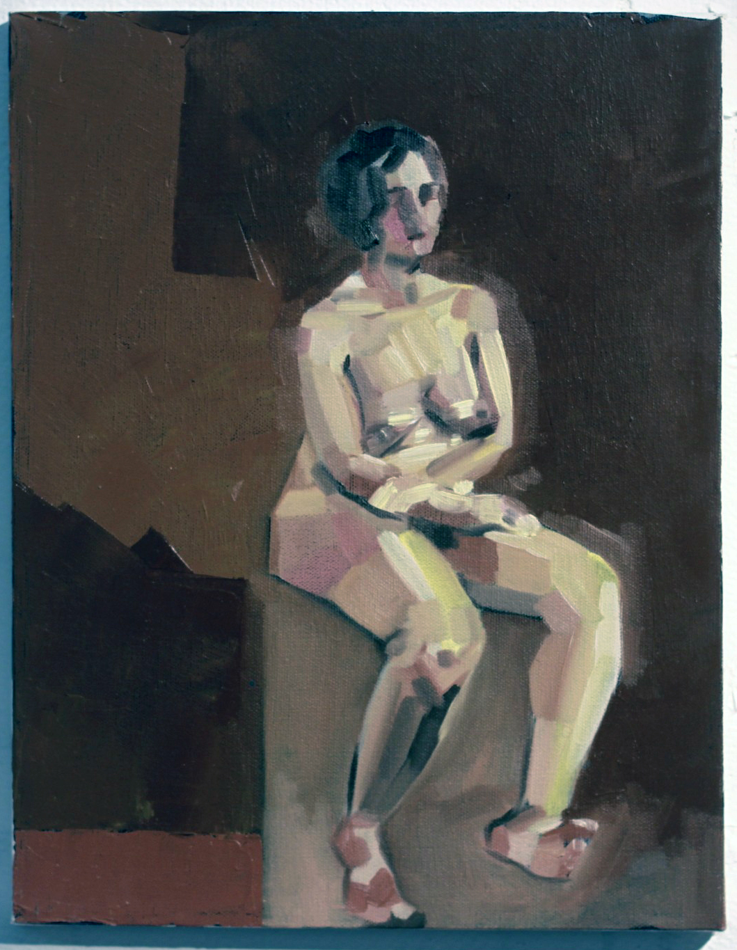
Seated Nude #3, Oil, Acrylic, Graphite on Canvas, 8”x10”
Who are these women? What do they represent to you?
The current paintings are all of Melissa, my girlfriend. Most of the older works are of Emma, a friend. The Emma paintings really fall under the self-portrait category, they’re about me at the time if anything. There were a couple of early Melissa paintings that fell under that category as well, namely Seam Ripper and Discrete Mathematics, after which point I dropped the expressive self-portrait vein for the reductive paintings.
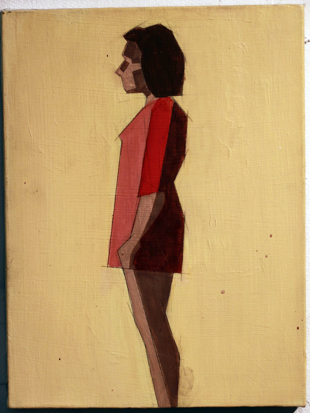
The reductive paintings are a lot less about expression and more about study. Every painting is an attempt at adding or manipulating a variable in a previously established control. When something works I add it to the control; I add it to my toolbox. When it doesn’t work it remains exclusive to that painting. For instance: the blank figures in Seated Nudes 1 & 2 were an accident—I had placed a red ground, drawn the space, and painted the backgrounds. I decided before I painted the figures that they looked interesting as they stood, and left them. The silhouetted figure became part of my vocabulary at that point, and it reappeared in later paintings.
As far as what the women in the paintings represent to me beyond the above technicalities, I can’t really say. I try not to assign meaning to my paintings; I find I’m opposed to explaining the content because it places the painting in a box. A painting is infinitely more valuable to the viewer when they can assign their own meaning to it or attempt to glean the meaning themselves.
Reclining Nude IV, Oil on canvas 12”x12”
What sort of impression do you hope your works leave on the viewer?
It’s difficult to say based on the above statement. I hope it strikes a chord with them, I hope there’s something in them that they can take away. I hope they want to spend more time with it than five seconds.
[pureslideshow] https://thingsworthdescribing.com/wp-content/uploads/2013/03/gage8.jpg;https://thingsworthdescribing.com/wp-content/uploads/2013/03/gage7.jpg; [/pureslideshow]
Ian will be graduating from Massachusetts College of Art and Design this spring.
See more of his work on his Tumblr.
Mar 28, 2013 | street art
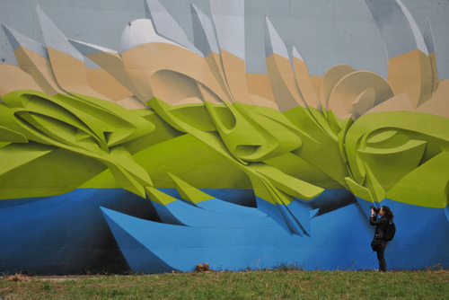
Sharp swoops emerge from the walls of parking garages and the sides of buildings, the one below is covered in shades of electric colors layered according to saturation with the densest boldest blue on bottom. The lettering seems to jut out into three dimensions, forming abstracted S-shapes with dramatic twists and extensions that reach up to the whitened top. It’s almost like a conglomerate of unfinished CGI designs from an oriental-themed Transformers movie, painted in lovely bold colors.
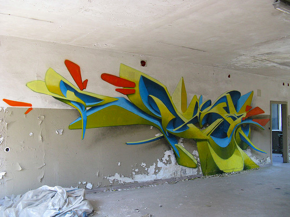
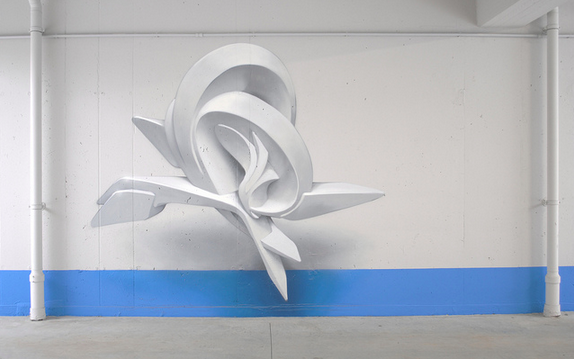
Sometimes the shapes take simpler forms, individual pieces of three-dimensional abstract shapes floating in space, usually arranged around the shapes that surround it. They form composite designs that are electrified by the power of whatever force keeps those shapes above ground, and the bright colors that slash their way through the forms only amplify the piece’s momentum. This 3D graffiti is created by the Italian artist Peeta, and his splices of futuristic bundles cover walls all over Italy.
September 2012, Banja Luka (BA) Graffiti Writing Jam
Peeta is also known as Manual Di Rita, and he has been a graffiti artist in Venice since 1993. By breaking down typographical forms and remaking them into dynamic shapes with deep shadowing, the whole design recesses into the wall. He said he particularly focuses on the lettering in his own name, Peeta, playing with the shapes of the letters and how much they can be twisted to become something else.
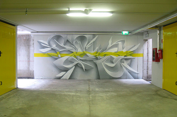
In an underground parking in Milan Italy, April 2009
In the Venice Industrial Port, Italy.
“Thus my own lettering is brought into the fluidity of the urban, where words are continuously ruptured from their own histories, readapted into idiom and gestures learned off the street,” he said,
“The final result derived from the fusion between traditional lettering and three dimensional style has ended up in giving life to a unique kind of visual rhythm, created by the intersecting lines between sections of conic, cylindrical and twisting surfaces. The role of sculpture comes to be essential for this purpose. It represents for me a direct contact with three-dimensionality in order to understand the rules of light and shadows and to reproduce them.”
Wall in Milan, Italy
For more of Peeta’s work, check out his website & Flickr.
Mar 27, 2013 | photography
A naked man stands before an empty gray background, shown only from the waist up, but parts of him are missing – whole sections of his arms and stomach and head are edited out. But instead of seeing bones and blood inside, there’s just a gaping clean-cut hole, and you can even see the same skin within him, as if we’re all just empty skin vessels filled with soul.
In the image below, the faceless man seems aware of his missing parts, looking down and reaching through the hole in his stomach with hands crisscrossed and fingers elegantly outstretched, feeling for something that isn’t there. His spine’s notches rise up at his shoulders, creeping to his neck.
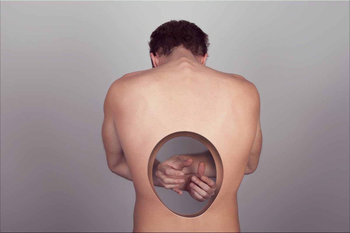
A warm light shines luminescent against his skin, almost white in some places, blinding but not quite. In the image below, the man doesn’t seem to realize his head’s upper half is missing, which could have something to do with the fact that his eyes are gone too. Cut right at where his mouth opens, his lower lip remains above a cavity of empty head – a basin of smooth dented skin with arms stretching behind it, as if his head were still there to lean on.

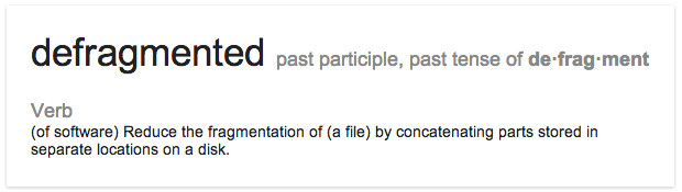
Defragmentados means “defragmented” in Spanish, which according to Google:
This man’s emptiness, without any sort of interior flesh, somehow makes him seem less human, and more like a virtual recreation that’s intended to do away with all the messiness we real humans have inside us.

Yago Partal is a 29-year-old Spanish artist doing editorial work for the special effects company DDT Efectos Especiales, which actually sounds like the greatest job ever. DDT won an Oscar for their work in Pan’s Labyrinth, and Partal uses his photography and photo manipulation skills to perfect their special effect designs.
Partal’s website is filled with conceptual photography like this – his Zoo Portraits series features exotic animals in suits and ties and is almost too adorable.

For more conceptual photography from Yago Partal, check out his website.
Mar 26, 2013 | painting
Two figures eerily creep through a scene, with a strong sense of light shooting up at them. Dark shadows are cast behind everything that catches the light, and within one of the corners sits a sculpted portrait bust, whose giant face looms like the Ghost of Performances Past. His nose is broken and his mouth is twisted, and the space behind his head is the only part painted black – an ominous warning against the dangers of acting, cautioning how much of your own self that might be forfeited in the desire to become someone else on stage.
And even though the subject matter may lean towards the creepy, the colors are anything but – bright oranges and whites against a pale green background, colors painted so thick that they become autonomous, living on their own within the 63 x 79 inches of canvas, bleeding and oozing but with enough restraint for detail. There’s a strong sense of the artist’s hand across a floor that’s painted in lines mimicking the light’s direction. But the walls and clothes seem to glow from the color within them, somehow shiny and organic at the same time.
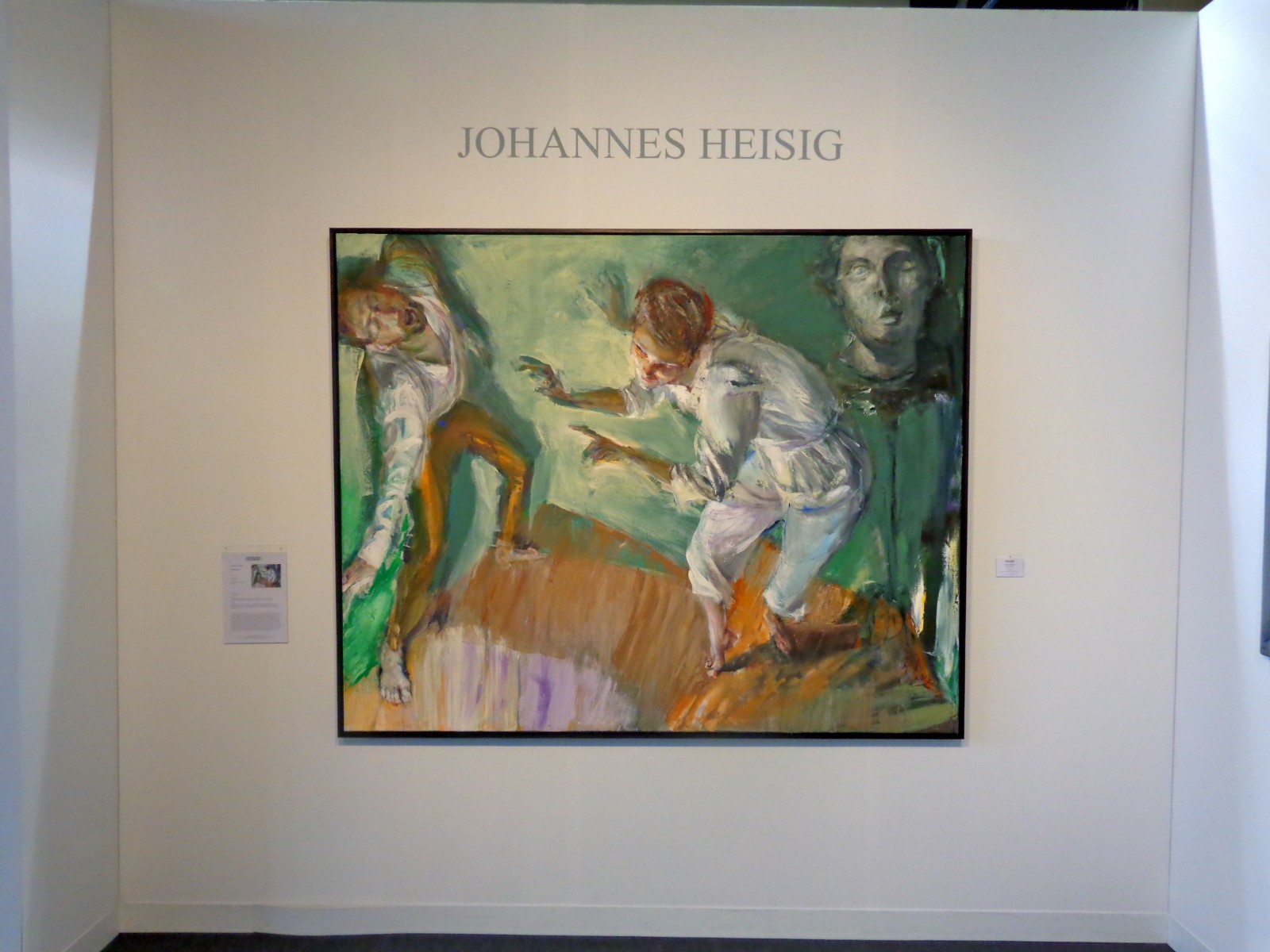
“Performance” by Johannes Heisig, 2012
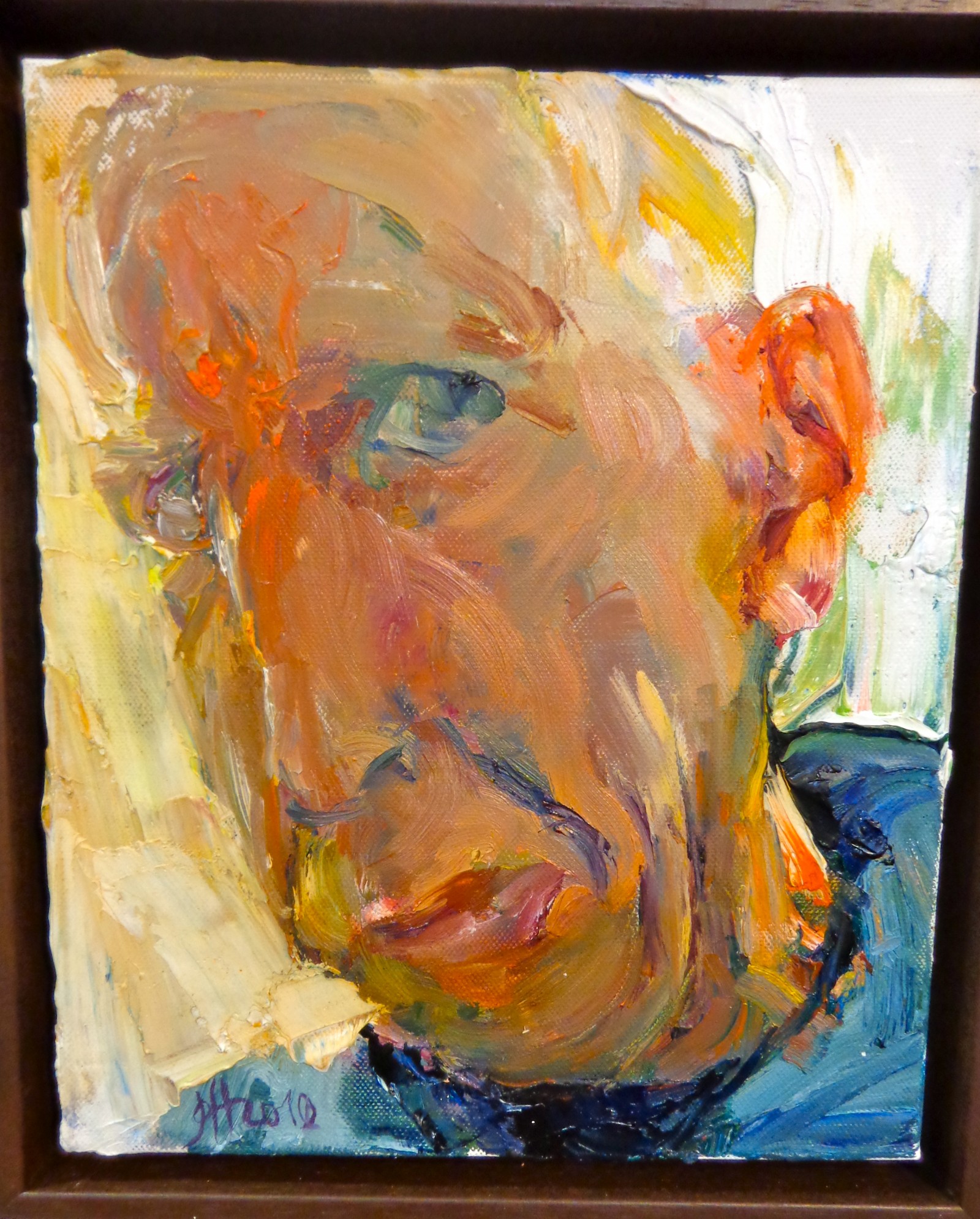
Also on view in Heisig’s booth on the Modern Art pier was a triptych of sorts – three watery interpretations of himself, each numbered as a different “Selbstbetrachtung” or “Self Reflection.” Each utilizes a distinct color palette and emphasizes a different part of the artist’s face – the first focuses on his nose, the second on his head/ear, and the third on his mouth and chin, as if he painted three different still frames from one good head shaking. They could be three totally different people, and shown altogether they play with the ideas of how drastically the way we view ourselves changes from day to day and hour to hour.
The artist stares right at you in the middle portrait – his head swimming in bright colors that highlight the fleshiness of his skin that’s even painted a burning red/orange in some places. His eyes look out disapprovingly, his mouth puckered in a grimace as if he’s judging your outfits or your bad habits from within the frame. If you look closely, you can see each individual stroke of the artist’s brush – they seem random and chaotic, but somehow take a few steps back and they come together to become an impassioned kind of melting impressionism.
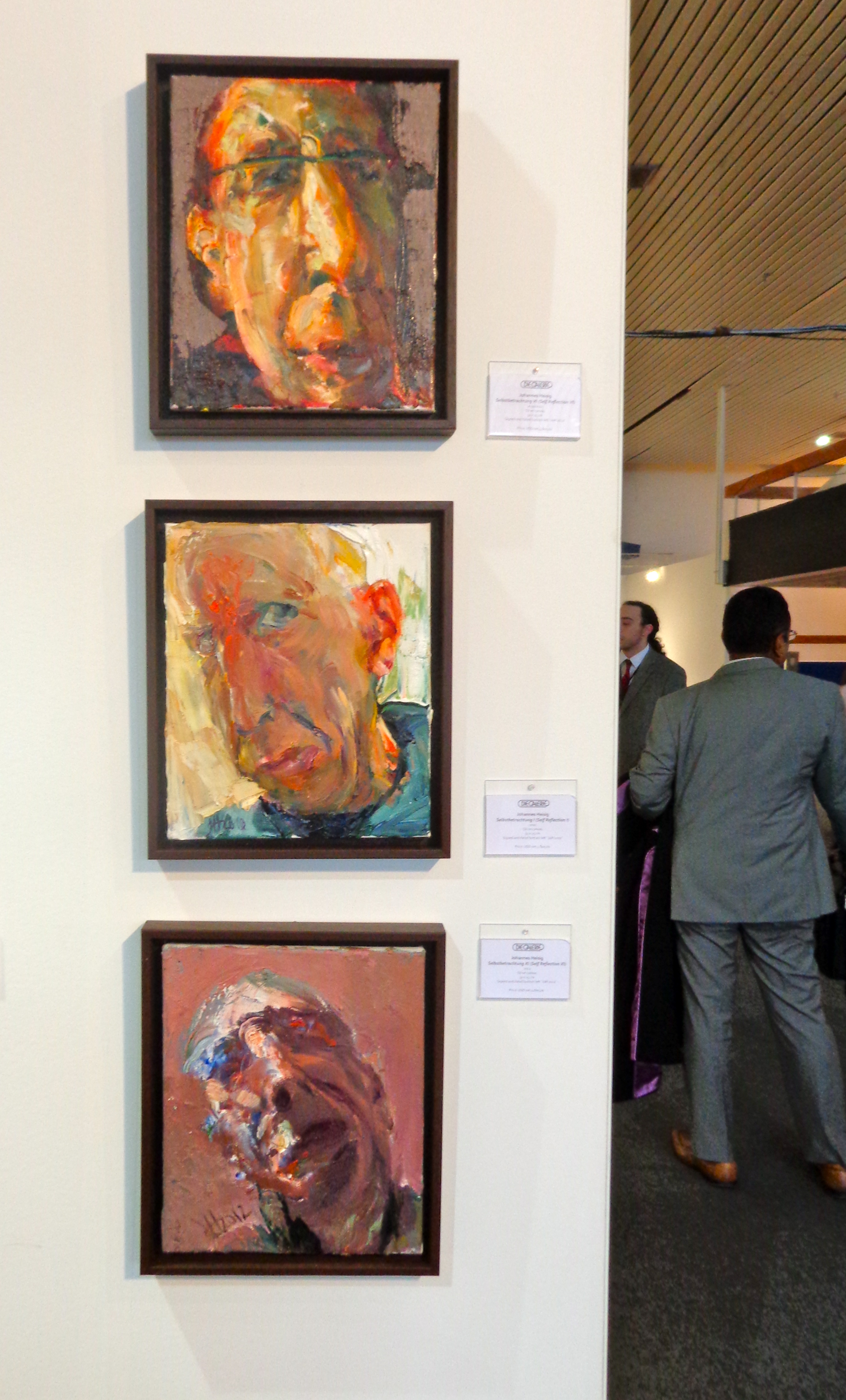
Heisig’s “Selbstbetrachtung” or “Self Reflections”
Johannes Heisig, 60, has been described as a social realist painter working in subjective expressionism. From Germany, he’s painted a number of German politicians and also works in graphic design and illustration. His artwork has been shown throughout Europe since the early 80s, and at the Armory Show he was represented by Die Galerie in Frankfurt.
“Selbstbetrachtung I (Self Reflection I), 2010.
See more from Johannes Heisig on his website.
Mar 25, 2013 | installation, sculpture
A silver hand stretches from the sky, cut off just below the elbow and grabbing hold of an older black Fiat 500, stopping the car in its tracks. But there’s no driver in the car, so perhaps before it wasn’t moving. After all, the hand’s grip is loose and casual, long thick silver fingers folded over windows – fingers the size of legs, like they belong to a five-footed monster with no face.
It’s not a monster, but a child’s hand, holding the car like a toy, playing with it along our teeny tiny streets. The name comes from what most children say while they play with toy cars: “vroom vroom,” evocative of the way we all sort of speak our lives into existence, validating with words that end up being just as small as we are.
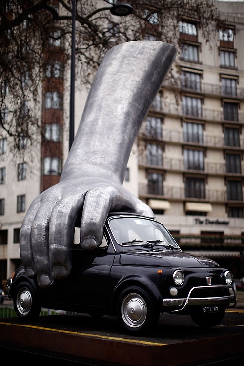
Because how much control do we really have anyway? If our brakes fail and smash us into a building, how much difference would it make knowing that a giant metal baby was in charge of all the chaos? Would you trust the baby more than a bearded prophet with surviving stories?
Lorenzo Quinn uses his sculpture as a visual facility for communication, all with the goal of helping viewers develop values like understanding, tolerance, and harmony. A Roman-born artist who studied at the American Academy of Fine Arts in New York with the intention of becoming a surrealist painter, Quinn discovered his passion for sculpture at 21 and moved to Spain after the birth of his first child. Now at 47 Quinn’s sculptural works have become enormously successful, shown all over Europe since the late 80s.
“I make art for myself and for people who want to join me on a walk through my dreams,” Quinn said, “The way we live our own lives, is paramount. That is why most of my work has to do with values and emotions. ”
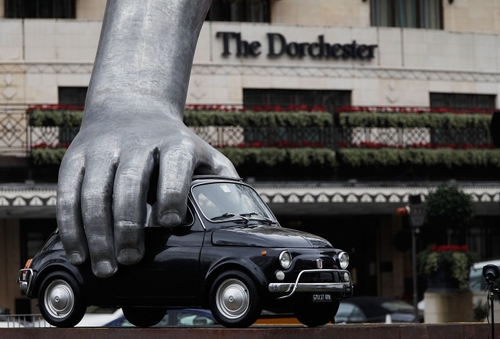
“Vroom Vroom” was initially presented at the Institute of Modern Art in Valencia, Spain in the summer of 2010, and appeared that same year at the Abu Dhabi Art Fair. In January 2011 the sculpture was settled in Park Lane, London as part of the Westminister City Council’s sculpture festival.
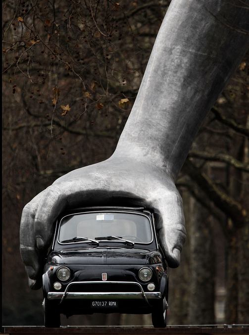
The nearly 15 feet high sculpture creates an open dialogue about our place in the world, the child’s hand indicating the littleness of it all and the title opening all sorts of other discussions about reality, awareness, and language – what does it mean to you?
See more of Lorenzo Quinn’s work on his website.


