Nov 16, 2016 | interviews, painting

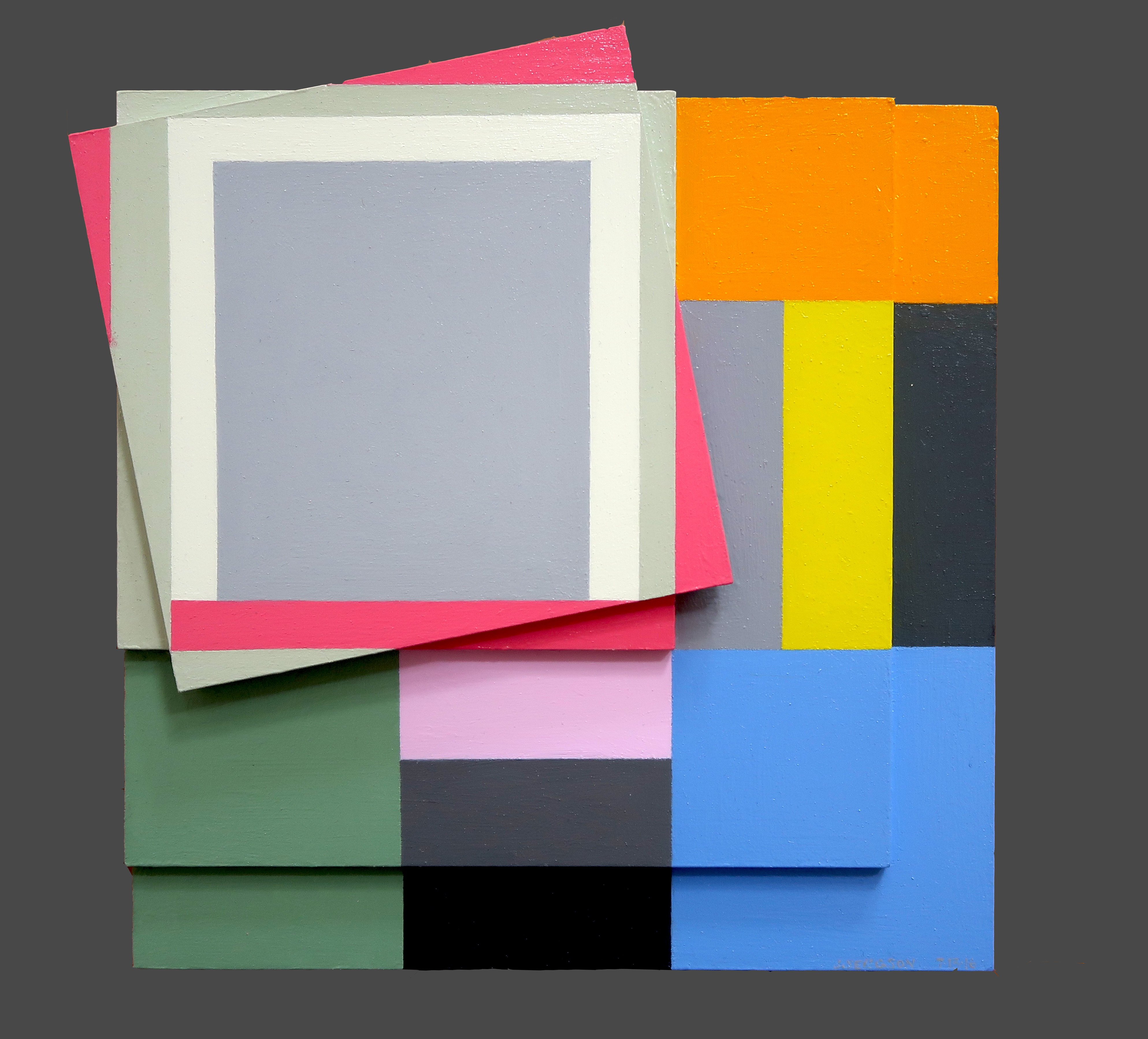
Judith Seligson
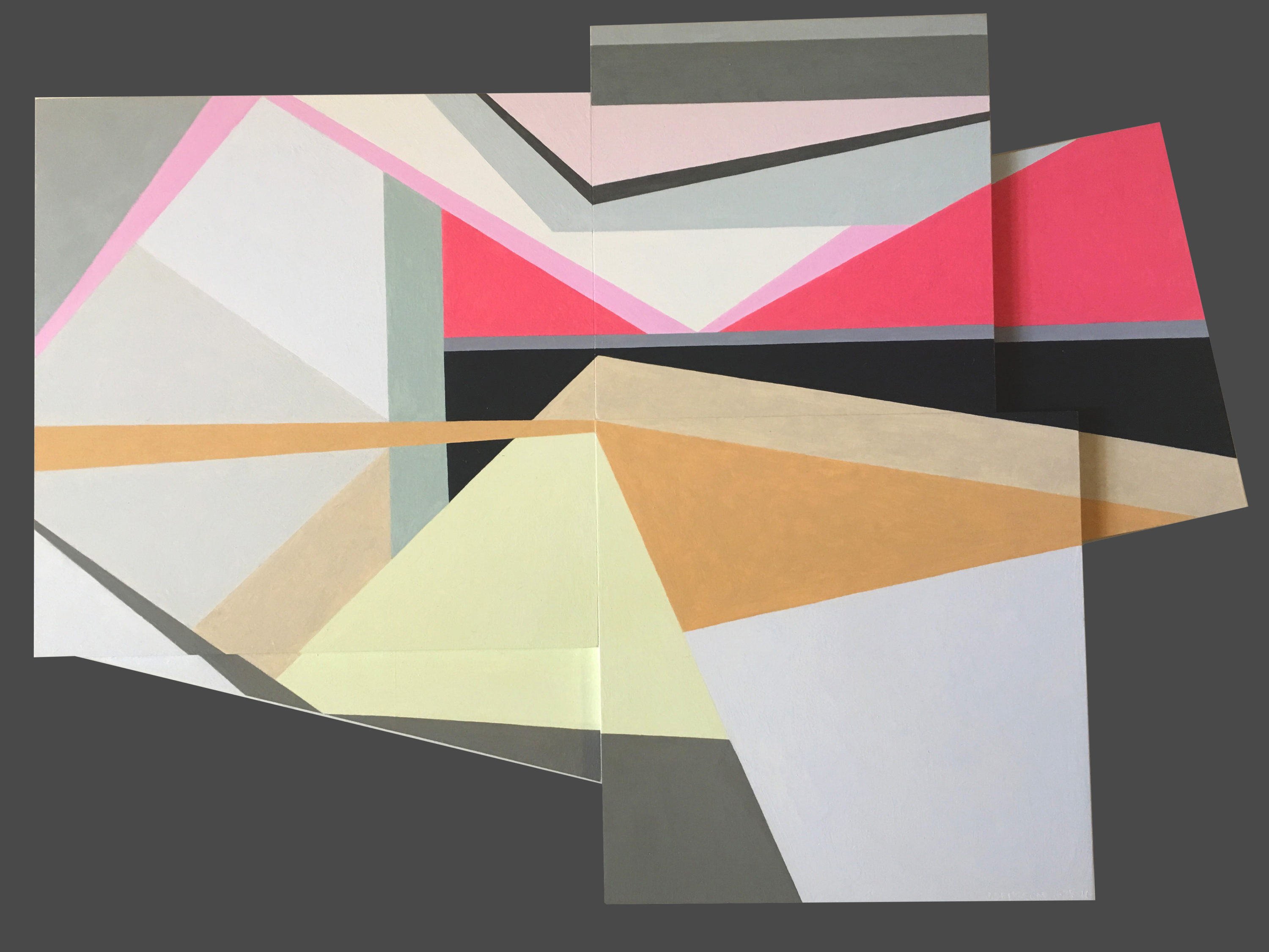
Signs Of Struggle, 2016
Oil on panels
8.5 x 8.5 in.
Courtesy of the artist
Colors fracture, shapes surface, and together the two work in tandem to continue Josef Albers’ exploration of minimalist, geometric compositions. Judith Seligson’s new exhibition Drawing the Line is comprised of elegant, cheerful examples of shape and color getting well acquainted.
How did you begin in geometric painting? What was the initial spark of inspiration for you?
I developed a series of charcoal drawings in my first studio, in Cambridge, MA in 1973, just after I graduated from Harvard, that presaged everything that was to come. I was drawing from life; both the studio itself and a vase of my mother’s dead roses were my subjects. Despite charcoal’s propensity for infinite shades of gray, I found myself using the charcoal simply to outline discrete empty shapes. Each petal surface was a shape. This method flattened objects and made them of a piece with everything else in the work, like tesserae in a mosaic.
At that time, too, I was studying a book called Cézanne’s Composition: Analysis of His Form with Diagrams and Photographs of His Motifs by Erle Loran. He “reduced” a painting to a series of lines of force. I began applying this method to some of my favorite Vermeers. Vermeer too focused my attention on drawing architecture.
My love of building blocks and of finding hidden structures in a painting and in life continued to grow and develop. Still, I pushed against it then and still do. In 1978 I had a show of painting pairs – each pair used the same palette, but one was geometric and one expressionist. I ended up pursuing the geometric direction, thinking that I could always pull the expressionist one off the back burner if I needed a change. When I look at those small painting pairs now, I find the expressionist ones much better than the geometric ones.
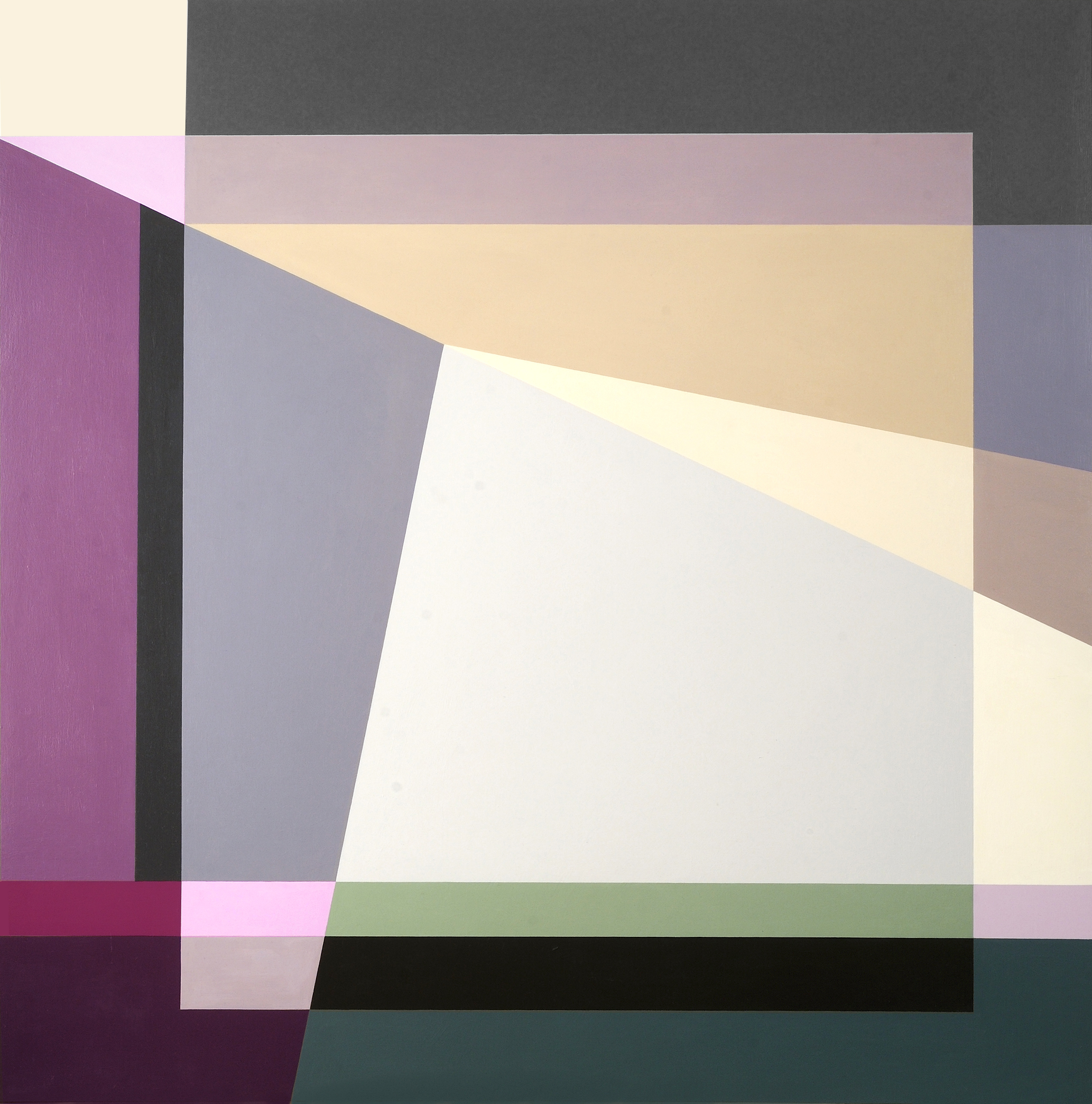
Judith Seligson
Golden, 2016
Oil on panel
7 x 7 in.
Courtesy of the artist
Galérie Mourlot describes your work as having a “feminist bent.” In what ways do you see your work as uniquely feminist?
Here is a quote from my article, Contrapuntal Painting, which appeared in the Radcliffe Quarterly, March 1992:
“Many of my paintings are diminutive, intimate, three to five inches in either direction. Rather than physically overpowering (as many men are to women), they suggest a more interactive relationship with the viewer. Smallness in art may be coming under a more favorable star, but in my lifetime size has mostly been a directly proportional measure of importance and, though no one would admit it, quality. The small works are painted on paper. Arthur Danto has aptly pointed out that paper, since it is so expendable, is considered a less “serious” medium than canvas, panels, or walls, and so has become associated with the artist’s “intimate moods.”
“Paper and women have a lot in common in that they both have developed a reputation for being less than serious but good for intimate moods, and maybe even expendable. I take these stereotypes, these preconceptions, and play with them. I draw on the bare paper — actually four-ply museum board — and then apply multiple layers of a gesso wash to protect the painting from the board. This way I can be serious, intimate, expendable, and conservable all at once.”
Judith Seligson
Healing Brush, 2016
Oil on panel
6 x 6 in.
Courtesy of the artist
When did you first introduce three-dimensionality to your work?
About four years ago. I was making a series of collages using, among other things, fragments of my own paintings. These were works I didn’t love or didn’t think were finished, but couldn’t toss. Then I started placing paintings that I had signed into a single composition. That led to adjusting one or the other to improve the composition. Then I started gluing together completely blank panels. At that point, I didn’t know how I wanted to paint them. I looked at them for over two years until I figured out the topological painting in Fine Tuned.
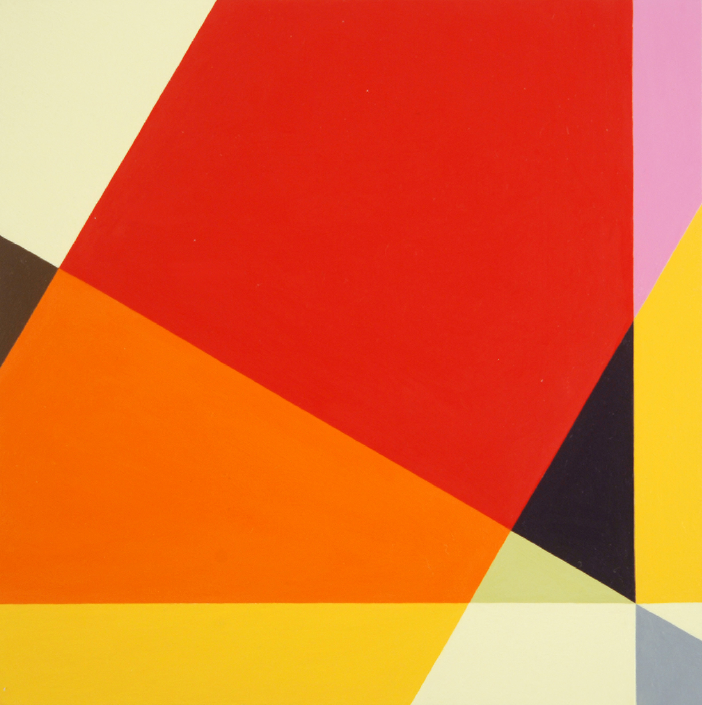
Judith Seligson
Complications, 2016
Oil on panel
11 x 16 in.
Courtesy of the artist
Can you walk us through the process of creating one of your works? Which comes first, color or shape?
The chicken or the egg. Each painting begins with a graphite line drawing. Usually, I draw directly on the painting surface. Sometimes, I trace a drawing onto a panel, or enlarge a small drawing onto a larger surface. I draw and erase until I see the blank shapes pushing and pulling, à la Hans Hoffman, moving in the shallow 3-D illusionary space created by an interplay of color and form.
I then apply several layers of thinned gesso, sanding between layers, to get a very smooth surface. The drawing is still visible, but the graphite will not mix with the paint.
Positive shapes, like a vase, will appear in front of a negative shape, like the shape around the vase. Matisse said that painting begins when you can see both the vase and the space around it at the same time. Warm reds push forward, blues recede. I work each against the other so that the color shapes are pushing and pulling my eye around the surface in what I call I visual melody. I will use a cool color to push back a shape that appears too forward, or a warmer color to pull forward a shape that is receding. Like a great song, a visual melody is a whole structured by notes, tempo, dynamics, and a sense of beauty – or is it pleasure? Each shape is a note in several simultaneous visual melodies, playing on the scales of hue, tone, temperature, intensity, and negative/positive shape. I have called my work Contrapuntal Painting, in that counterpoint in music is created by two or more melodies played simultaneously. Each is both an independent melody and also the harmony to the other.
In this sense, too, my work is feminist. Man and woman can be the counterpoint to each other, rather than the woman traditionally being only the harmony to the man’s melody.
Judith Seligson
Self Portrait, 2014
Oil on panel
36 x 36 x 2 in.
Courtesy of the artist
Which artists or websites do you most often find yourself looking towards for inspiration?
I look to many of the Dutch painters – Rembrandt, Vermeer, Mondrian, and de Kooning. Their devotion to structure and to light in a painting is a constant inspiration.
I like Elizabeth Peyton’s small portraits and Cecily Brown’s paint handling. I like Peter Halley’s electrical circuit paintings. I look at and read Artforum and Bookforum in print. Intermittently, I read artnet News, Hyperallergic, and Blouin Artinfo.
Judith Seligson
Candy, 2008
Unique digital painting on canvas
43 x 43 in.
Courtesy of the artist
Drawing the Line opens tomorrow, November 17 at Galerie Mourlot on 79th Street in Manhattan where it will remain on view through January 9, 2017.
Jul 31, 2013 | news, painting
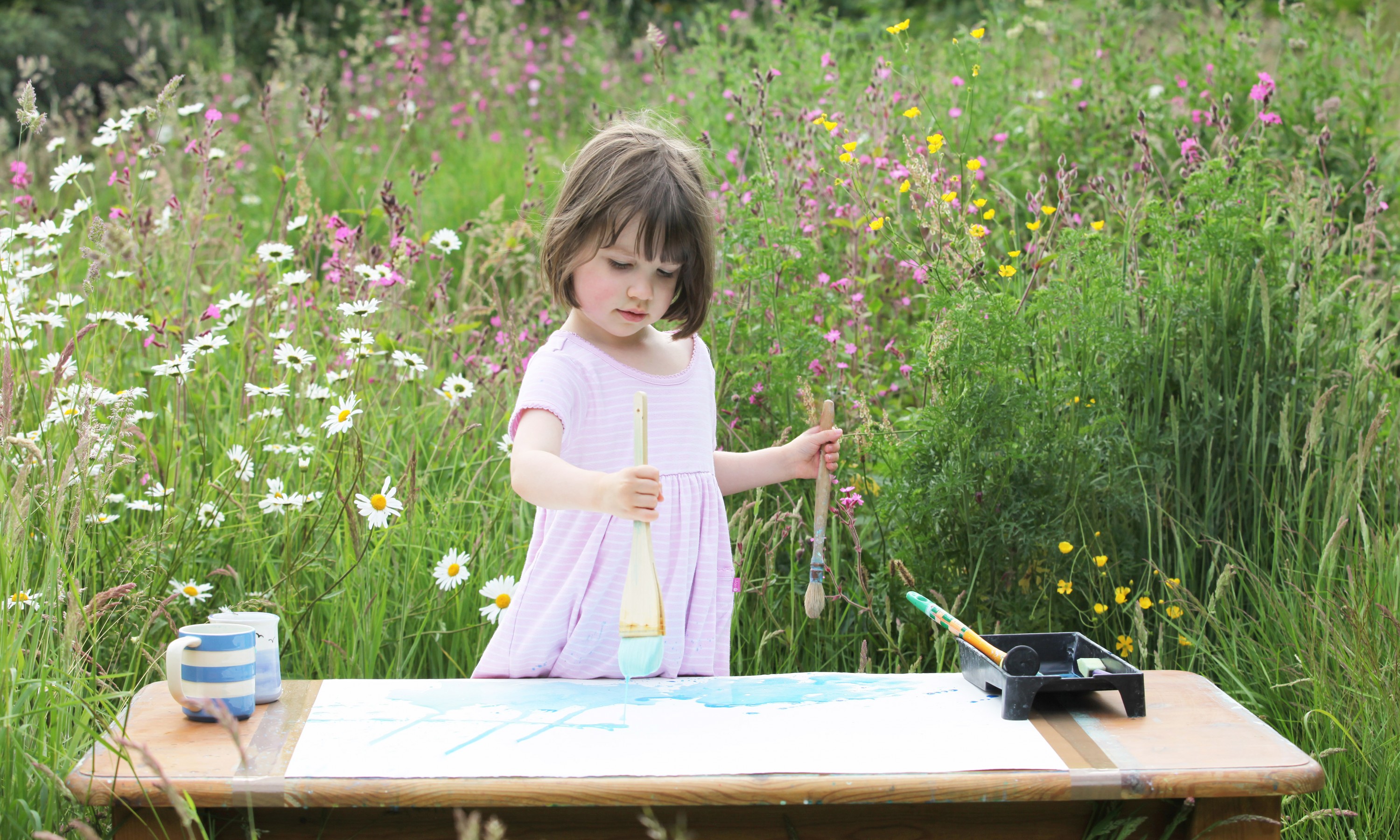
Iris Grace is one incredible 3-year-old. Well, technically she’s three and a half. It’s difficult for her to interact with others because she has autism, which keeps her from speaking, but she’s able to express herself through art and movement. One of her favorite things to do is paint, and the works she creates could fit right in at a gallery featuring interpretations of Monet’s Water Lilies.
Sometimes her colors get chaotic, but in every painting there’s always an overwhelming sense of balance and calm. Bright colors in watercolor and acrylic splash to fill up each canvas, and even though the works would technically be considered abstract, each feels more like a landscape, or rather a place – an abstract place where things are simple, beautiful and bright.
Her mother writes:
“Iris loves nature, water, flowers, trees, wind, books, pictures, dancing on tip toes and always carries something in her left hand.”
“Blue Water”
“Underwater frog”
“Music at Sunrise”
Iris’ parents have been sharing her paintings online, raising awareness for autism and the National Autistic Society and the Autism Research Trust. Now Iris’ talent has been featured in every major UK newspaper, along with most online news resources in the US. They’ve also begun selling Iris’ originals and prints to raise funds for her treatment. From August 18th – August 29th they’ll be auctioning off her piece, “Follow the Fleet,” by email bids.
Even though everyday things are more difficult, Iris has a lasting attention span when it comes to painting, spending around two hours on each piece. When she’s in the mood to paint, she lets her parents know by pointing at her mug and brush sitting near the sink. She points to the colors she wants to use from the paints in the cupboard, and they mix the paints with water for her. She tests them out, taking them back for remixing if they’re not the right consistency. She’s even starting making her own colors, dipping her brush in multiple mugs before bringing the color to the paper.
Iris flicks and dabs the paint, using different rollers, sponges and brushes to get the effects she’s looking for. Since she can’t speak, her parents name the paintings for her, using their content or Iris’ mood as a guide.
“She used to be consumed by books, eye contact was a rare occurrence, she didn’t want to or know how to play with us, showed obsessive behaviours, got desperately distressed when we took her near any other children and her sleep patterns were all over the place,” her mom Arabella writes on her website, “She now rides on my back in fits of laughter, squealing with delight, plays, communicates by creating her own signs and her sleeping is much better.”
“Rolling Balls”
“Monsoon”
All images and information from Iris’ website.
For more from Iris, find her on Facebook, Twitter and Flickr.
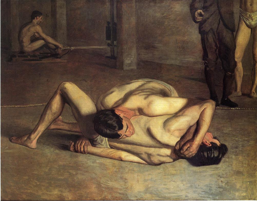
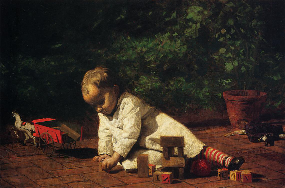
Jul 25, 2013 | art history, painting, photography
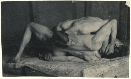
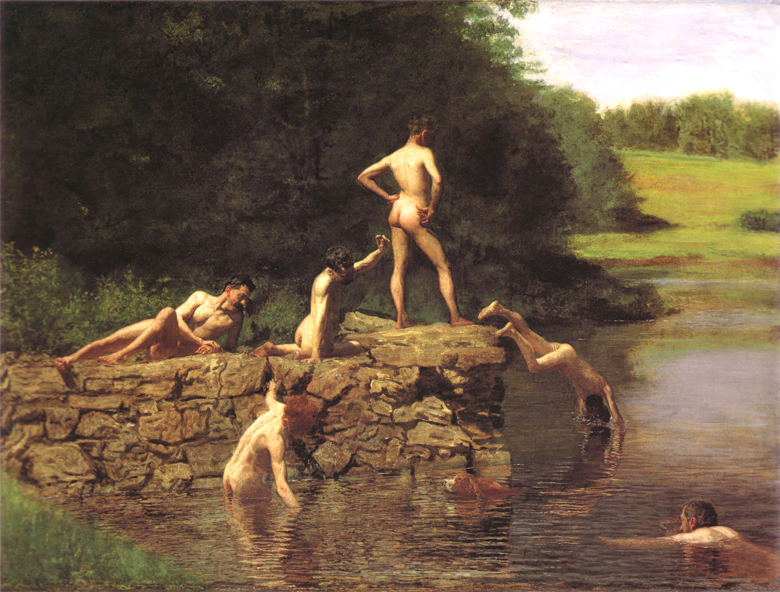
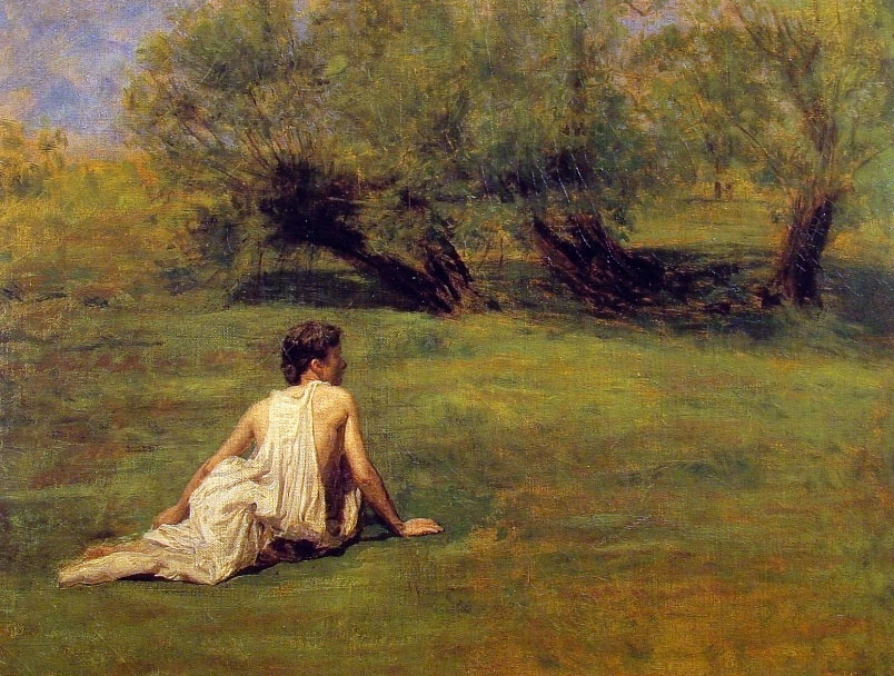
Thomas Eakins lived from 1844-1916, and spent the majority of that time as an artist – painting, photographing, sculpting, and teaching others the craft. He was an American realist painter whose style is remembered for its loose, rich color. Eakins used photography, still a relatively new technology at the time, to study the details of a body in motion as it travels through space – a practice now regarded as one of his most important innovations.
“Strain your brain more than your eye… You can copy a thing to a certain limit. Then you must use intellect.”
-advice to his art students; quoted in Lloyd Goodrich, Thomas Eakins (1933)
Photography

Motion study: Male Nude, Standing Jump to Right, 1885.
image source
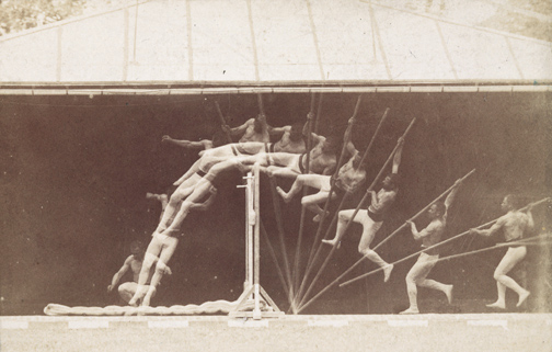
Motion Study: George Reynolds, nude, pole-vaulting to left, 1885
image source
He explored the heart of American life through portraiture, but didn’t receive recognition until late in life because of his role as a controversial figure when it came to the sexes. His studies of the male nude were often regarded as homoerotic, and later made him a major figure of art historical sexuality studies in the 1990s.
He insisted on teaching men and women the same way, using male models in female classes and vice versa, but was also accused of abusing female students. The scandals cut his success short, and his influence in the history of art was only realized after his death.
Painting
For more info about Thomas Eakin, see the artist’s Wikipedia page.
Apr 9, 2013 | painting
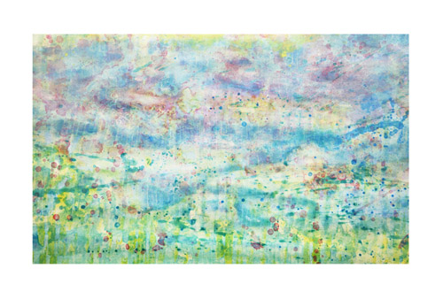
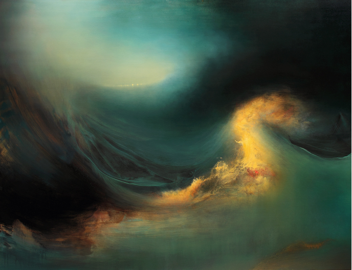
Frothy clouds and hazy distances make for simple scenes of awe in Samantha Keely Smith’s paintings. They’re landscapes taken to a new level – sparkling, glowing and fading – shining enigmas that show more of what we all hope heaven looks like than anything we could ever dream of seeing on this earth. The gods and elements interact without people to mess things up – water, nature and light converging into one scene of wonder.
Land combines with water in “Shift” – a wave of cloud crests in the sunlight above blue sand dunes and before misty air that shines in warm effervescence. Below the breaking wave you can see into the distant blue, to what looks like a glowing forest with clouds instead of leaves. Between two of the center trees shines a white spot of light, like a patronus spell being cast in the distance, or the center seed from which all this beauty has sprung.
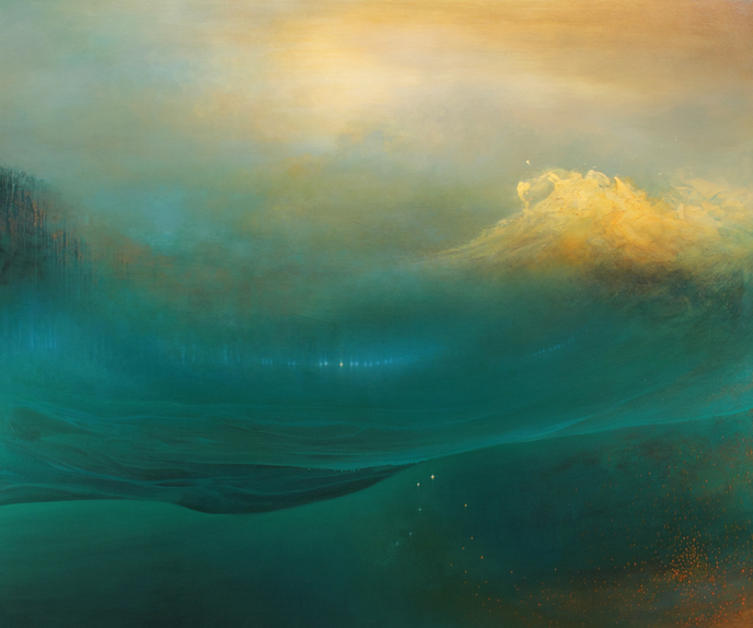
Shift
oil, enamel, shellac on canvas
60″ x 72 “
2012
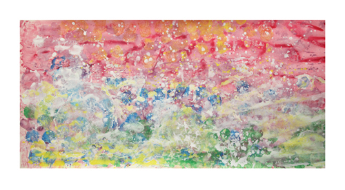
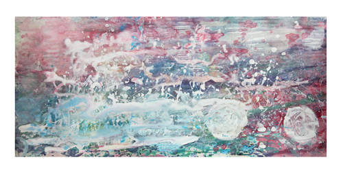
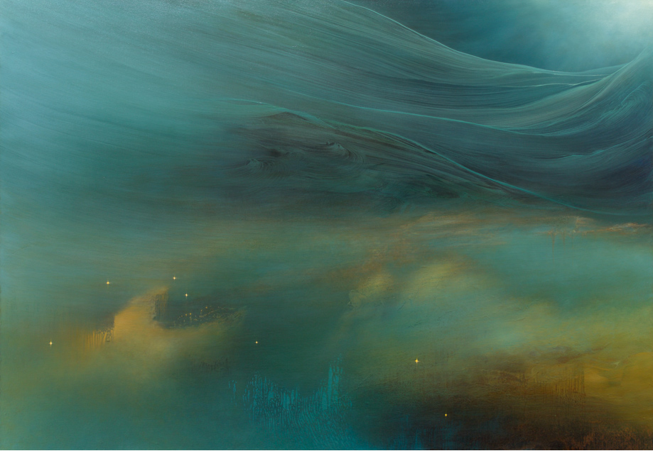
The waves get speckled orange in “Progeny” – light clouds of paint breaking and bursting in the foreground before a shimmering blue-green haze. “Mutiny” substantiates the water more, almost letting it fill up the canvas and submerging us below its depths, but not without a look into the distance at the land that might be there. Again with a breaking wave as the focus, this one glows bright white, splashing up with spots of pink and shades of orange. “Gathering” shows the calmer scene of a watery mountainside that leads off into the light.
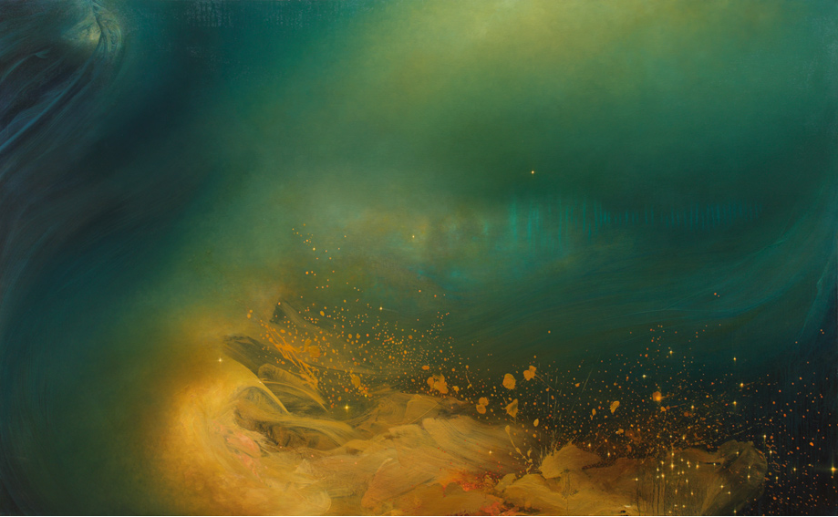
Progeny
oil, enamel, and shellac on canvas
48″ x 78″
2013
Samantha Keely Smith was born in England but moved to the US as a child, and now lives and works in New York. Her work has been shown all over New York City and in Arkansas as well. In 2011, her solo exhibition on Madison Avenue was featured as an Editor’s Pick on ArtInfo, who wrote that her works, “play at the edge of abstraction, blurring between light-filled fields and non-objective compositions.”
Samantha’s artist statement reads:
“Smith’s artwork represents a striving to reconcile the inner world of instinct and the tidal sweep of our emotional life, with an external world that is both beautiful and hostile in its natural grandeur. She attempts to map the place where these worlds intersect.
The translucent layers of paint, contrasting soft ethereal brushwork and harder edged sweeping gestures, echo this divergence and depict a timeless place that hovers between dream and reality in a way that is simultaneously alluring and menacing. The work exhibits the struggle between and among the variety of human impulses: impulses that are as necessary as they are contradictory, and which therefore constantly undermine our psychic and social coherence even as they endow us with vitality, soul, and life. “
Mutiny
oil, enamel, shellac on canvas
60″ x 78 “
2012
Gathering
oil, enamel, and shellac on canvas
50″ x 72″
2013
For more of Samantha Keely Smith’s work check out her website and her Tumblr.
Mar 26, 2013 | painting
Two figures eerily creep through a scene, with a strong sense of light shooting up at them. Dark shadows are cast behind everything that catches the light, and within one of the corners sits a sculpted portrait bust, whose giant face looms like the Ghost of Performances Past. His nose is broken and his mouth is twisted, and the space behind his head is the only part painted black – an ominous warning against the dangers of acting, cautioning how much of your own self that might be forfeited in the desire to become someone else on stage.
And even though the subject matter may lean towards the creepy, the colors are anything but – bright oranges and whites against a pale green background, colors painted so thick that they become autonomous, living on their own within the 63 x 79 inches of canvas, bleeding and oozing but with enough restraint for detail. There’s a strong sense of the artist’s hand across a floor that’s painted in lines mimicking the light’s direction. But the walls and clothes seem to glow from the color within them, somehow shiny and organic at the same time.
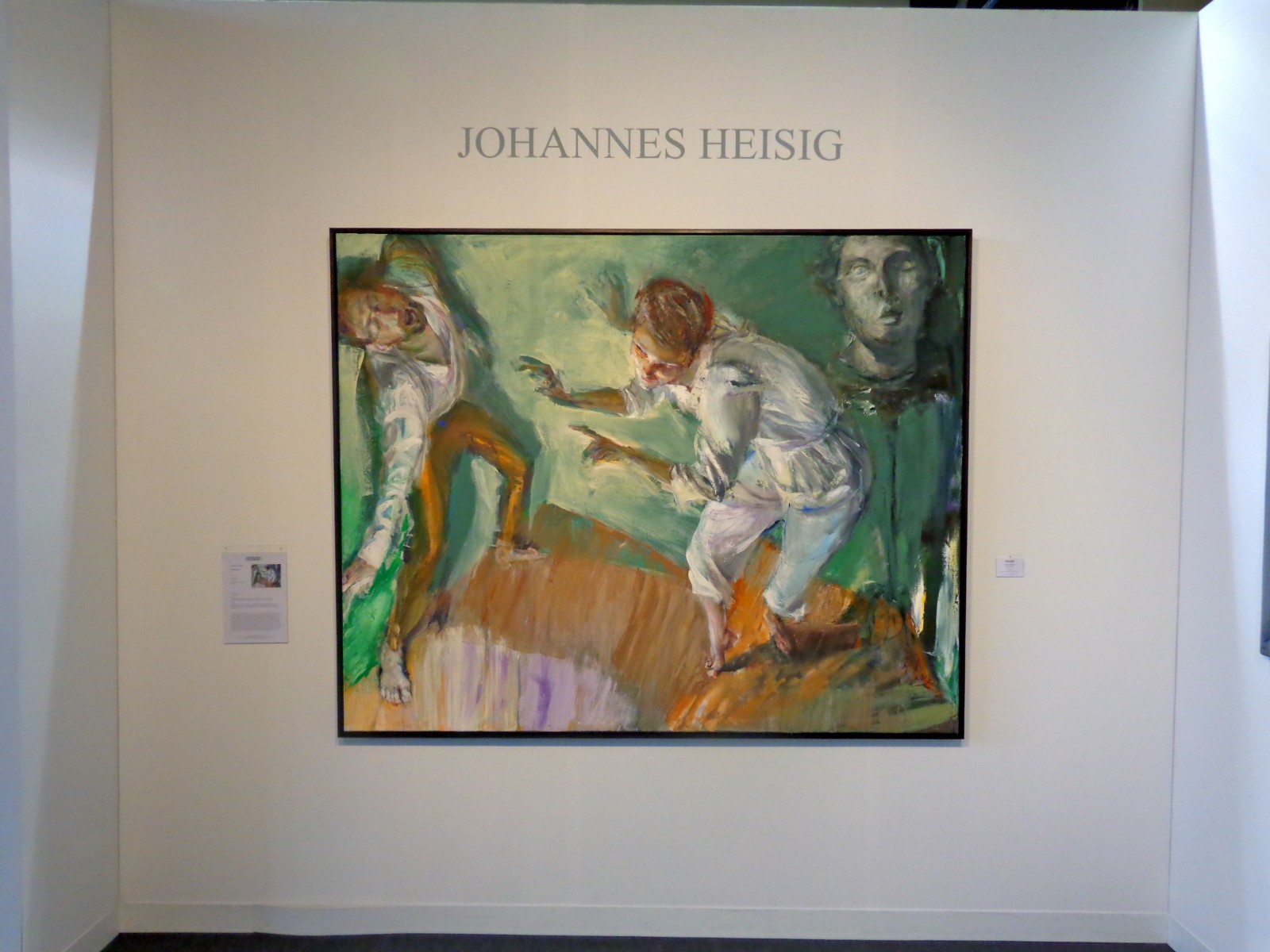
“Performance” by Johannes Heisig, 2012
Also on view in Heisig’s booth on the Modern Art pier was a triptych of sorts – three watery interpretations of himself, each numbered as a different “Selbstbetrachtung” or “Self Reflection.” Each utilizes a distinct color palette and emphasizes a different part of the artist’s face – the first focuses on his nose, the second on his head/ear, and the third on his mouth and chin, as if he painted three different still frames from one good head shaking. They could be three totally different people, and shown altogether they play with the ideas of how drastically the way we view ourselves changes from day to day and hour to hour.
The artist stares right at you in the middle portrait – his head swimming in bright colors that highlight the fleshiness of his skin that’s even painted a burning red/orange in some places. His eyes look out disapprovingly, his mouth puckered in a grimace as if he’s judging your outfits or your bad habits from within the frame. If you look closely, you can see each individual stroke of the artist’s brush – they seem random and chaotic, but somehow take a few steps back and they come together to become an impassioned kind of melting impressionism.
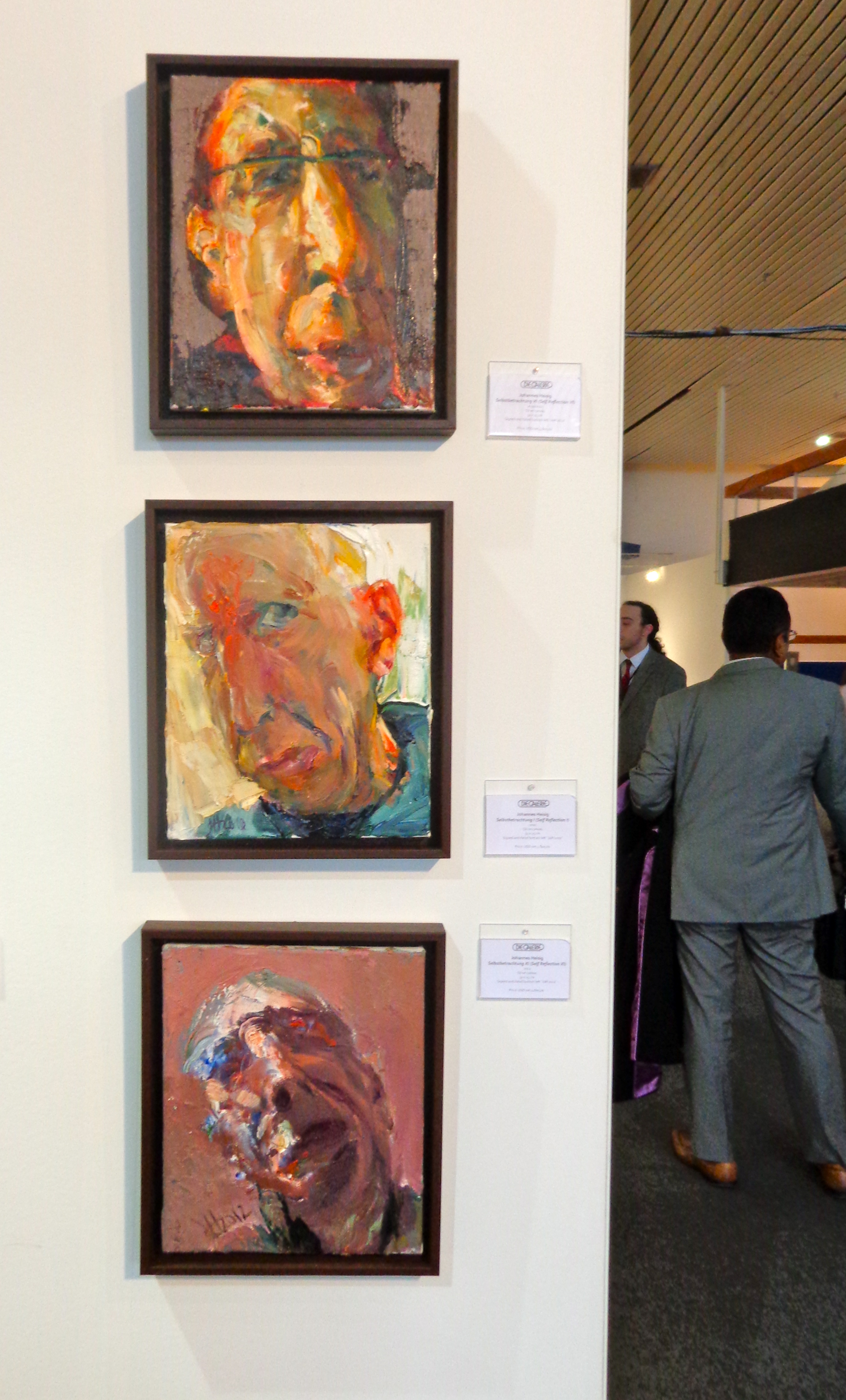
Heisig’s “Selbstbetrachtung” or “Self Reflections”
Johannes Heisig, 60, has been described as a social realist painter working in subjective expressionism. From Germany, he’s painted a number of German politicians and also works in graphic design and illustration. His artwork has been shown throughout Europe since the early 80s, and at the Armory Show he was represented by Die Galerie in Frankfurt.
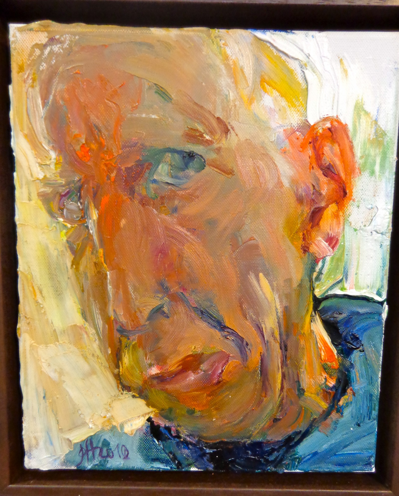
“Selbstbetrachtung I (Self Reflection I), 2010.
See more from Johannes Heisig on his website.